A Simpler Vim Statusline
Everyone that uses Vim and their grandmothers have apparently adopted the use of statusline plugins like vim-powerline or vim-airline. The latter, more recent vim-airline has gained popularity due to the fact that vim-powerline was deprecated in favor of a still-in-development rewrite that aims to provide a more general foundation for people to use the same kind of statusline in other areas, such as tmux and shell prompts (cringe). So now everyone can have the same look: solarized and some powerline-like status, everywhere.
There’s of course nothing wrong with using these plugins, but I’ve come to realize that they’re overdone for my particular needs, and I don’t even really care for how they look.
Patched Fonts
First there was the annoyance of having to use patched fonts to achieve the “powerline look”. This isn’t a huge problem since it’s pretty straightforward to track down, download, and install pre-patched fonts. This has only become somewhat more annoying due to the fact that the new powerline rewrite patches fonts differently, so you have to find the patched font for the version of powerline you use, and different plugins adopt different versions. Now do this for every OS you use, in my case, Windows, Linux, and OS X.
The point is that in the grand scheme of things, when you take a step back, you realize you’re doing all of this for a mere statusline in a particular application (or two).
Noise
By default, powerline shows the mode you’re currently in, git branch if applicable, file name, file format, file encoding, file type, percentage through file, line number, column number, as well as flags that show whether you’re in paste mode, if the file is modified, or if it’s read-only. The plugins also sport an entirely custom CtrlP statusline.
When I switched over to airline recently I decided to take advantage of the fact that it’s somewhat customizable. At first I only did so to manually define a colorscheme I wanted, since the predefined one I had been using kept being changed around by upstream.
Then I came to realize that I didn’t need all of that information. This is a similar conclusion I came to when I recently redesigned my shell prompt. I started by shortening the Vim mode part of the statusline, e.g. NORMAL became N.
I rarely ever need to care about the file format, encoding, or type. If I do, I can simply set ff, fenc, or ft respectively to have them printed. The file type in particular I can usually deduce from the file extension or contents, unless I’ve explicitly set it myself.
Similarly, I don’t need the current line number to be in the statusline since it’s already in the number line on the left which I always have visible due to relativenumber. This has the effect of numbering the current line as line 0. Setting number as well changes this so that the current line is numbered with the actual, absolute line number.
Finally, I’ve rarely cared to know how far I am in the file, but I admit that sometimes it’s useful to get an idea of how much more of the file there is, usually in something like a configuration file. For the rare occasion in which this is useful, this information is a simple Ctrl-G away.
Signal
After taking all of this away, what remains is the file name, column number, git branch, and status indicators for whether or not the file is modified, read-only, or in paste mode.
The column number has become indispensable for those language compilers/interpreters that output the column number on which an error was found, such as Haskell’s GHC. In fact, I’m now constantly annoyed by those that don’t do this. Given an error on line 30 column 24, I go to the line number with :30 and the column with 24| and I’m instantly at the problem location.
The file name is of course useful, specifically shown relative to the current working directory. The git branch is also useful and provided by the fugitive plugin.
Finally, a select few markers are very useful, such as whether or not the file has been modified since the last write, if a file is read-only, and if one is in paste mode.
After removing what I didn’t need, I ended up with this very customized airline installation, where the number on the right side is the column number:

Redesign
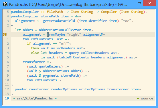
This statusline was fine, but I couldn’t shake the thought that it felt out of place with those colors and arrows; it felt overdone. I ended up commenting out my airline configuration—which was already pretty long—and attempted to create a statusline from scratch with the goal of simplicity. I ended up with this, where the number on the left under the number line is the column number:

I completely got rid of any mode designation in the statusline since I realized that I had the showmode option set, which already shows the current mode in the message line under the statusline. Further still, I created mode-aware cursors that change color based on the mode using the gcr option. Top-to-bottom: normal, insert, visual, replace, command:


Inactive Statuslines
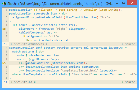
One piece of functionality that I wanted to preserve from airline was support for different active and inactive statuslines. In my case, I wanted this to be a subtle difference as you can see in the image below, where some things lose their color and the angle quotes become inverted:

This feature isn’t built into Vim, but it can be emulated by defining Vim auto commands on window focus events which refresh every window’s statusline:
function! s:RefreshStatus()
  for nr in range(1, winnr('$'))
    call setwinvar(nr, '&statusline', '%!Status(' . nr . ')')
  endfor
endfunction

augroup status
  autocmd!
  autocmd VimEnter,WinEnter,BufWinEnter * call <SID>RefreshStatus()
augroup END
The function that actually constructs the statusline is called Status. It takes an argument that corresponds to the window for which the statusline is to be constructed. I then detect whether the statusline being constructed is going to be active by checking it against the current/focused window:
let active = a:winnum == winnr()
I set the statusline using the %!SomeFunc() syntax so that the result of the function is the value that’s interpreted to construct the statusline. One problem is that when done this way, the function is evaluated in the context of the currently focused window and buffer, so if you use the value of &modified in your statusline somehow, and you have various windows but only the currently focused one is modified, all of the other windows will show the same modified marker, because the query as to whether or not they’re modified was done within the context of the focused window.
The documentation presented the solution to this problem:
Note that the “
%!” expression is evaluated in the context of the current window and buffer, while%{}items are evaluated in the context of the window that the statusline belongs to.Vim 7.4’s documentation
This means that if we want to perform behavior specific to the window or buffer for which the statusline is being created, we should wrap that in a %{} expression block:
let stat .= "%{&modified ? ' +' : ''}"
Defining a function to construct the statusline isn’t as complicated as it may seem. Once the boilerplate is defined, it’s a very simple way of constructing a statusline, and in my opinion more organized and manageable than typical, densely packed statusline declarations. For example, here’s the code for showing the file-modified marker, where Color is a helper function that conditionally colors the passed content based on whether or not the window is active:
let stat .= Color(isactive, 2, "%{&modified ? ' +' : ''}")
Here’s what the modified, paste mode, and read-only markers look like:


I didn’t want the read-only marker to be RO, so instead I got the inspiration from when one does sudo !! to re-do the previous command with sudo. In fact, I have a mapping for this that I found online, w!!:
cmap w!! %!sudo tee > /dev/null %
I finally had to redo the CtrlP theme from scratch as well, because I had previously customized it through airline’s API. This turned out to be pretty straightforward, since CtrlP itself exposes a function for this. With airline, I had this, which I specifically made to look like how it looked in powerline by default:

This actually looked pretty nice, in my opinion, but this look doesn’t mesh well with what I’ve created so far. I completely got rid of everything but the current mode and search scope path. Whether regex is turned on and/or if searching by file name is reflected in the CtrlP prompt already:

Conclusion
Like I said when I started out this post: there’s nothing wrong with using one of these statusline plugins. They certainly look nice and seem like a step up from the default statusline. It’s just that I took a step back and realized I didn’t need the things they offered, and they didn’t look as great as I had originally thought, back when I compared it to a default statusline.
For as much as some of these plugins claim to be “light,” it’s generally difficult to be lighter than using no plugin at all 1. It’s not that this extra code will make your Vim unusably slow with today’s hardware, but that it seems pointless to carry around if you’re not even using most of it, especially considering how simple it seems to be to define your own statusline, and—if you care to—personalize your setup.
-
lightline is one statusline plugin I know of—but haven’t used—whose philosophy it is to have the user define as much of the statusline as possible in the hopes of remaining light. I haven’t used it, so I can’t comment on it, but in my case defining my own from scratch was simple enough already. That said, this might be useful for others who find themselves in a similar position but who would rather use something maintained by someone else. ↩︎